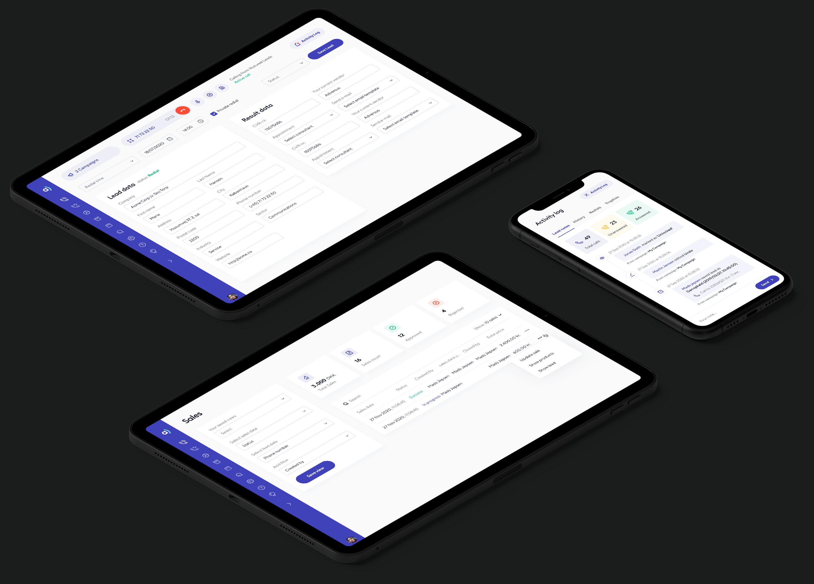

A dialer and CRM tool used primarily by call centers for telemarketing, fundraising, and appointment scheduling.
Adversus already offered a great product for its users, but was facing critical design related issues hindering further growth for the young company. We broke the problem down into four key objectives.
Adversus approached me to come on and lead them in the launch of a new identity and update to their product. In collaboration with Heartbeat, a team in Ukraine, we set out to create the new Adversus.
My role was researching, diagnosing, art direction and designing a better product experience.
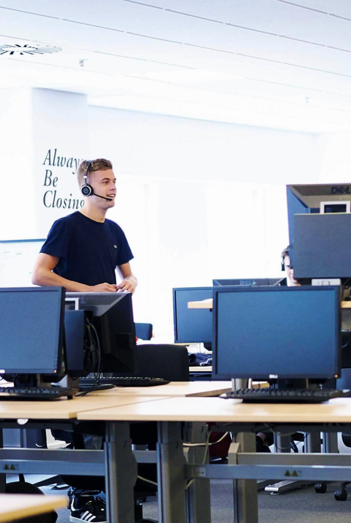

Our mission is to ensure enterprise-grade features to a broad audience through a highly intuitive user interface. New features and changes to the existing UI are centered around customer feedback. At the same time, we want to ensure quality, data assurance, and the highest up-time.
The whole process stretched 8 months from the first work-shop to launch.
Since Adversus is such a diverse and complex application, I had to understand the underlying reasoning and usage of each and every element. What data was used for what and when.
Afterwards we really started the process out with work-shops and brainstorming. How we imagined the process and what was our overall defined goals.

I used Mixpanel to get a good insight of the analytics and gather as much data as possible. I asked questions like: How much time is spent between calls? What data entry and functionality is prioritised in the dialer? How does leads groups get created and maintained?
To better understand user behavior and reasoning - not just observe the data, I set up multiple meetings with existing clients. I interviewed a variety of users types based on their organisational positions. Dialers, managers, planners, etc.
Doing my visits around to different clients, I would also observe users while they were working without any communication or interference.
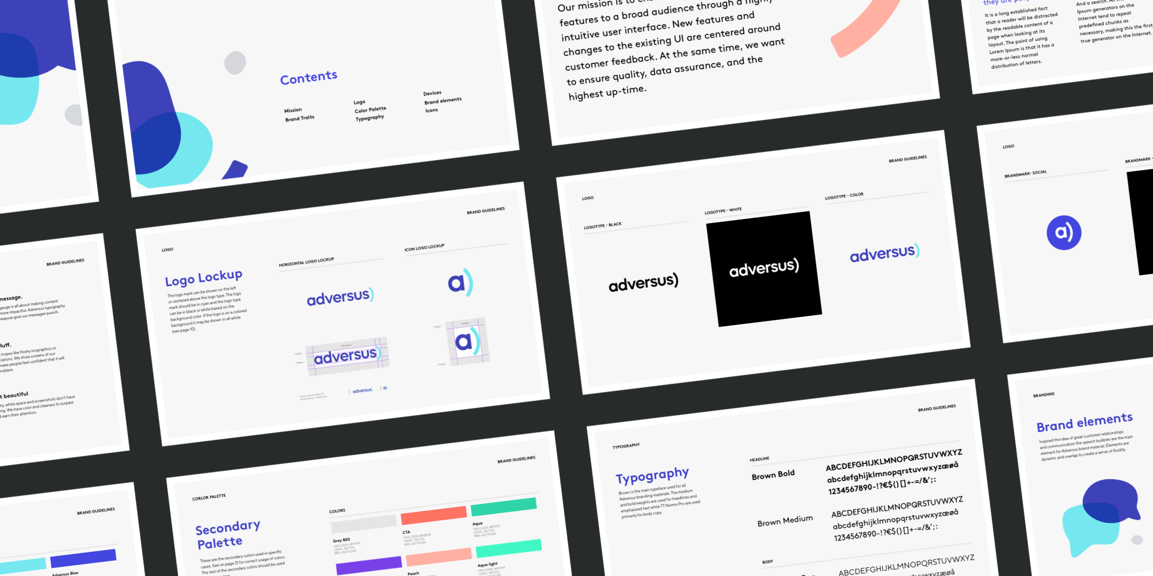
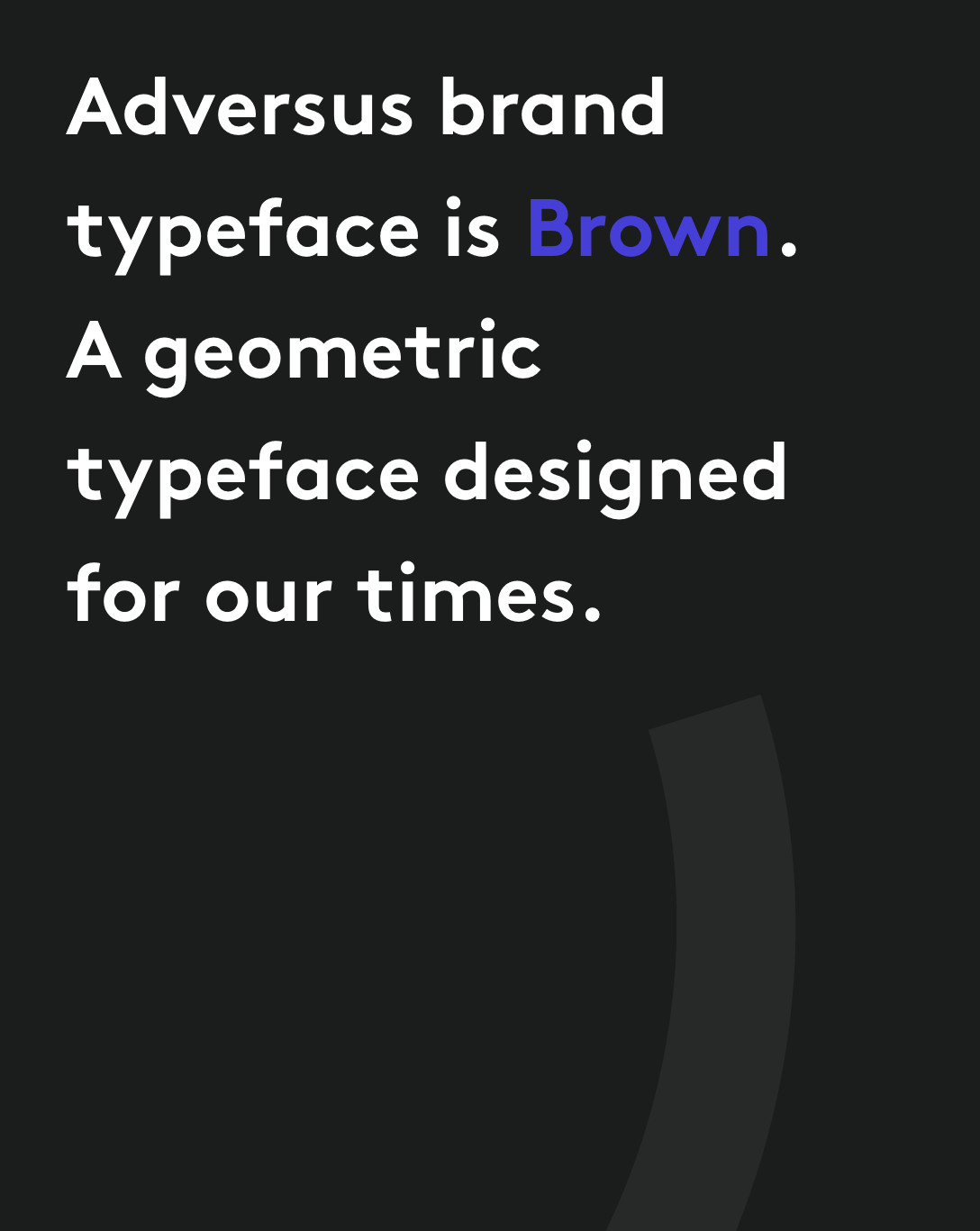
The branding and visual identity was long overdue for a more modern and updated look. The strategy was to create a welcoming and friendly identity. After we decided on initial mood boards, we went through several iterations of the new logo and thereafter brand material.
The overall brand symbolises communication and fluidity.

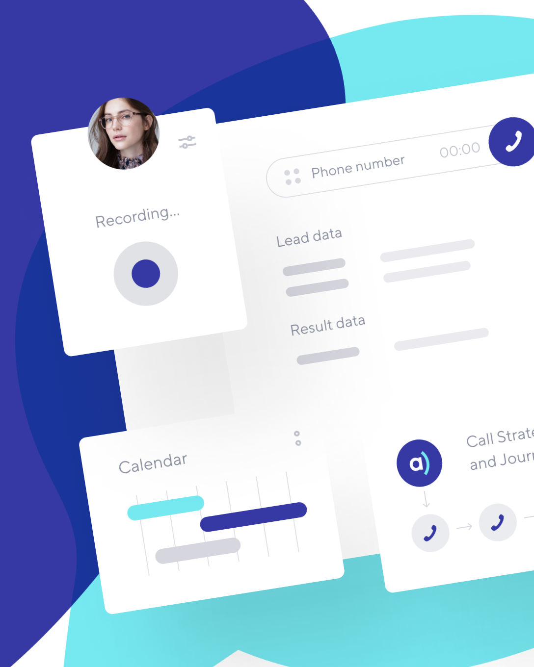
Doing my research, I realised 90% of the users known as “dialers” spent 97% of their time specifically on the dialer screen. It was an obvious aspect to focus on among others. All the information gathered from interviewing, brainstorms and work-shops really came together for the wireframing and prototyping.
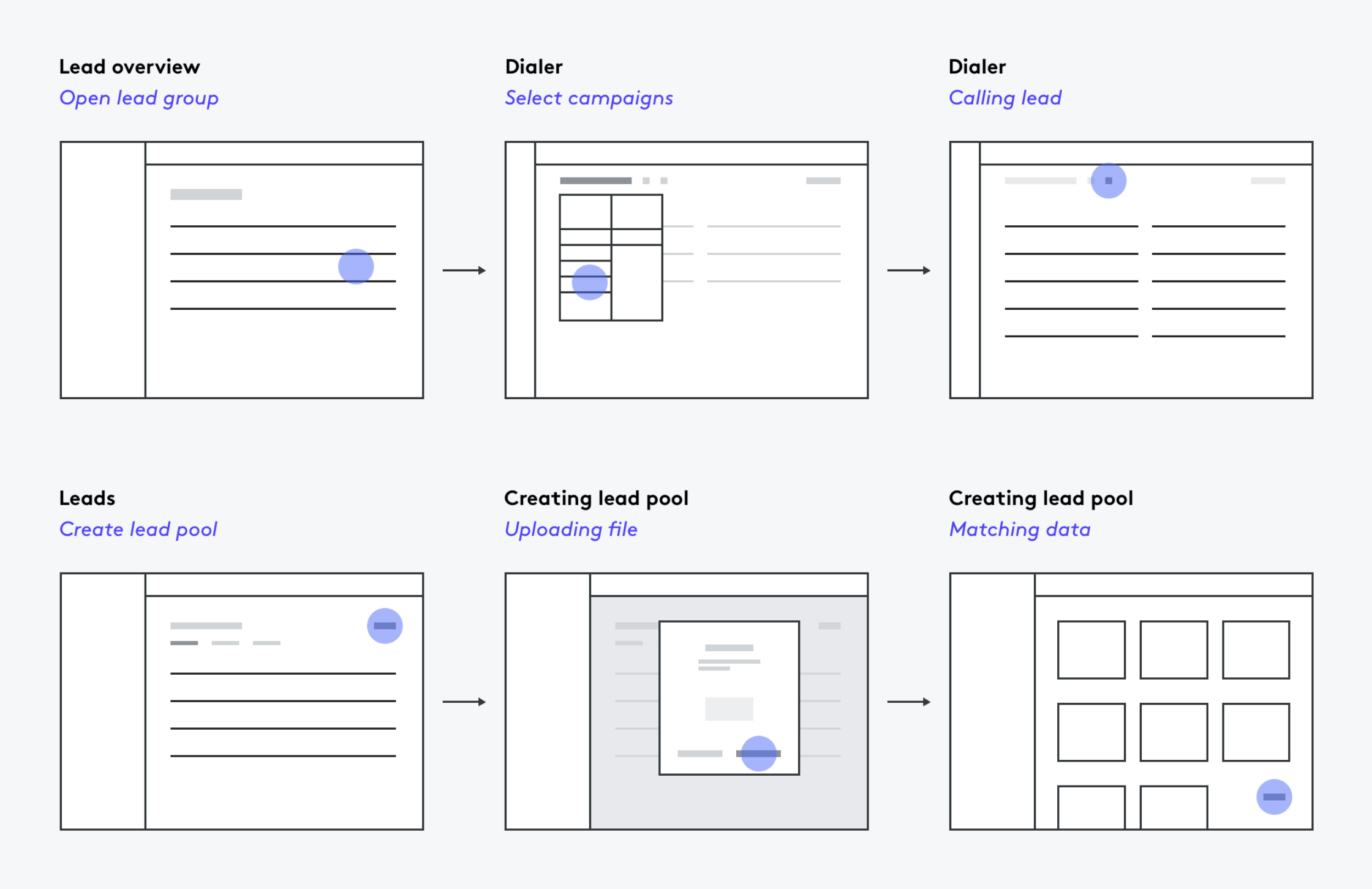
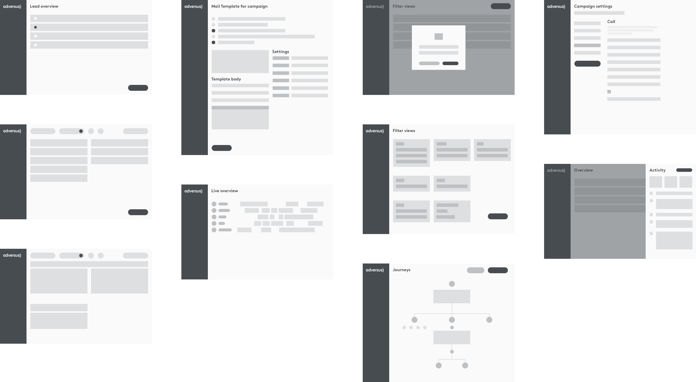
During the testing phase, I created low-fidelity wireframes to help us cut unnecessary parts from the UX and improve on existing parts with a design system in mind.
Naturally, there were some attractive interactions which ultimately got cut for the sake of the user experience.
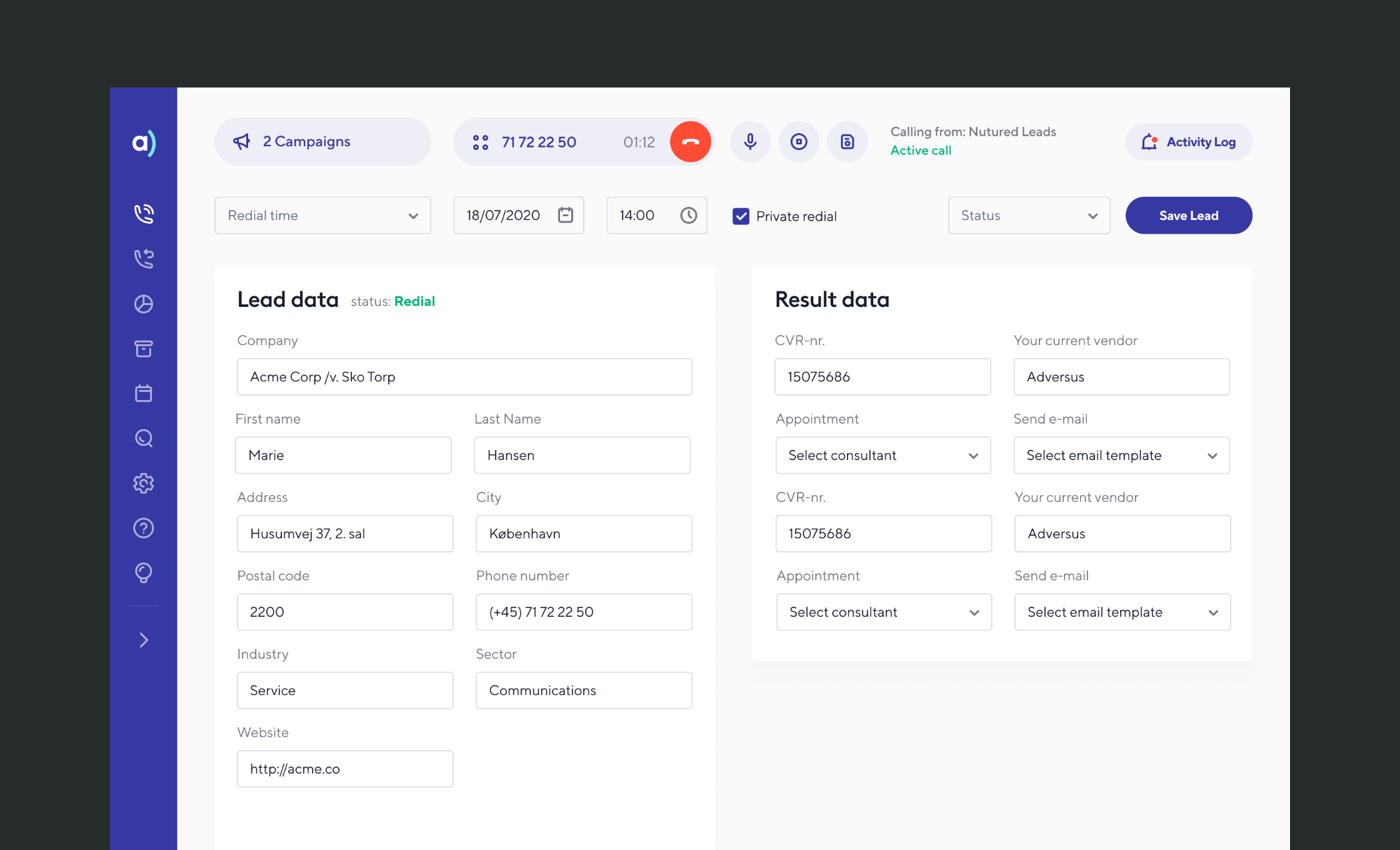
This is a small showcase of what it was all leading up to, the actual production of the interface.
The screen below is the previously mentioned dialer. We went through several iterations and ultimately came up with this solution.
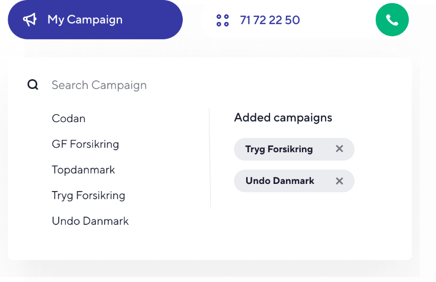
Previously you could only call on one cluster of leads at a time. During interviews, I discovered clients planned their work-flow around this limitation. I proposed a better solution.
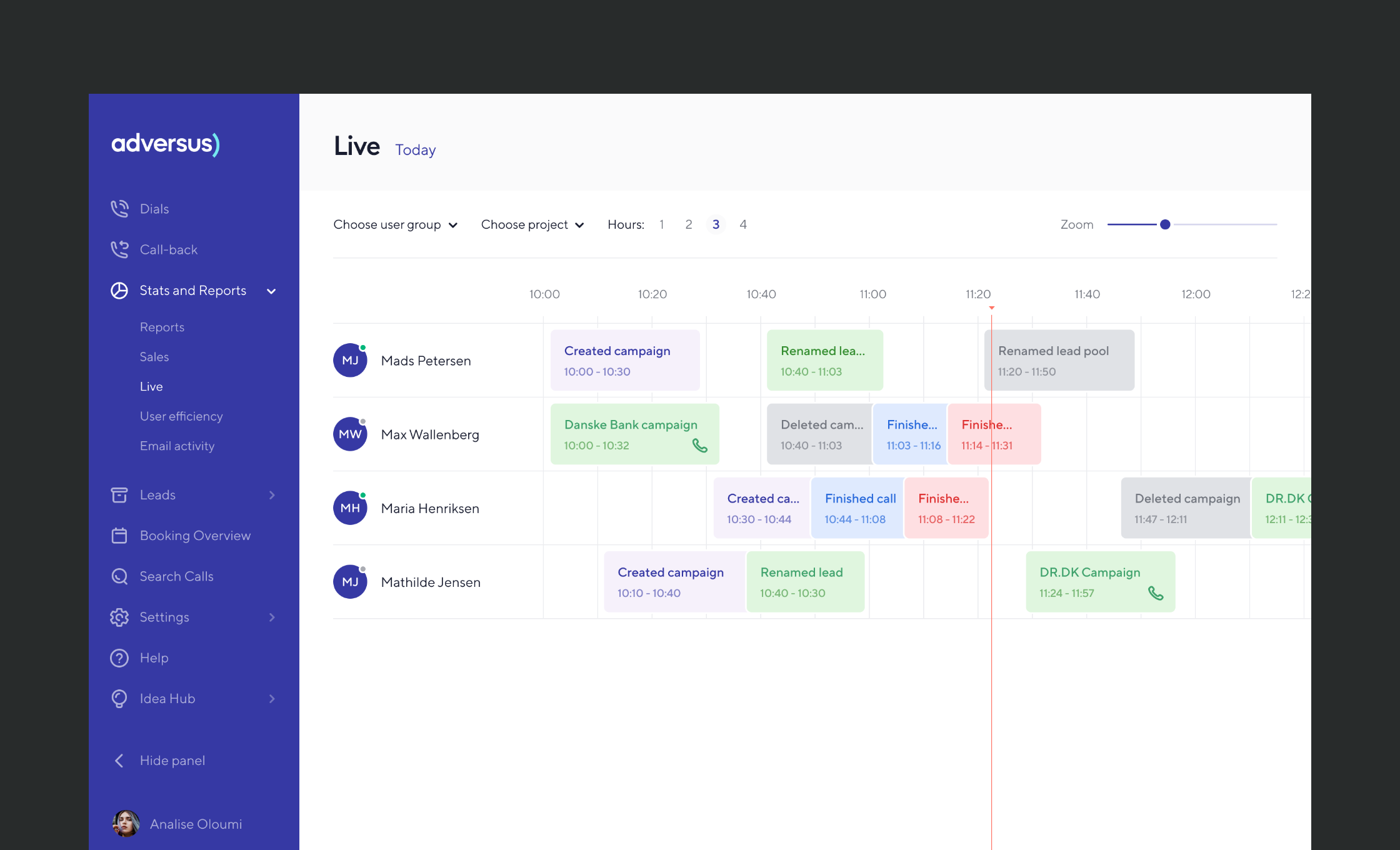
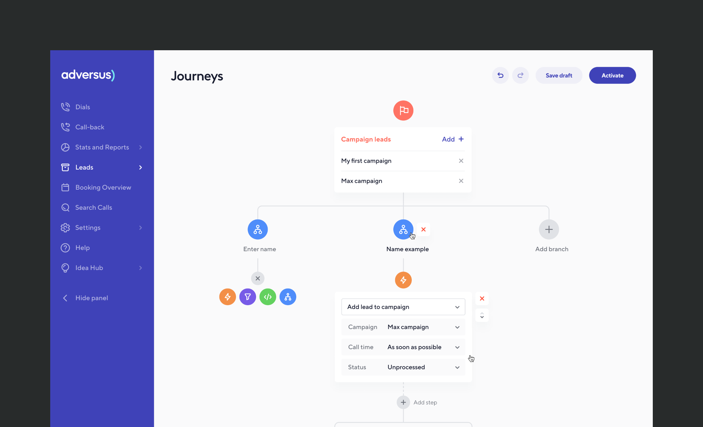

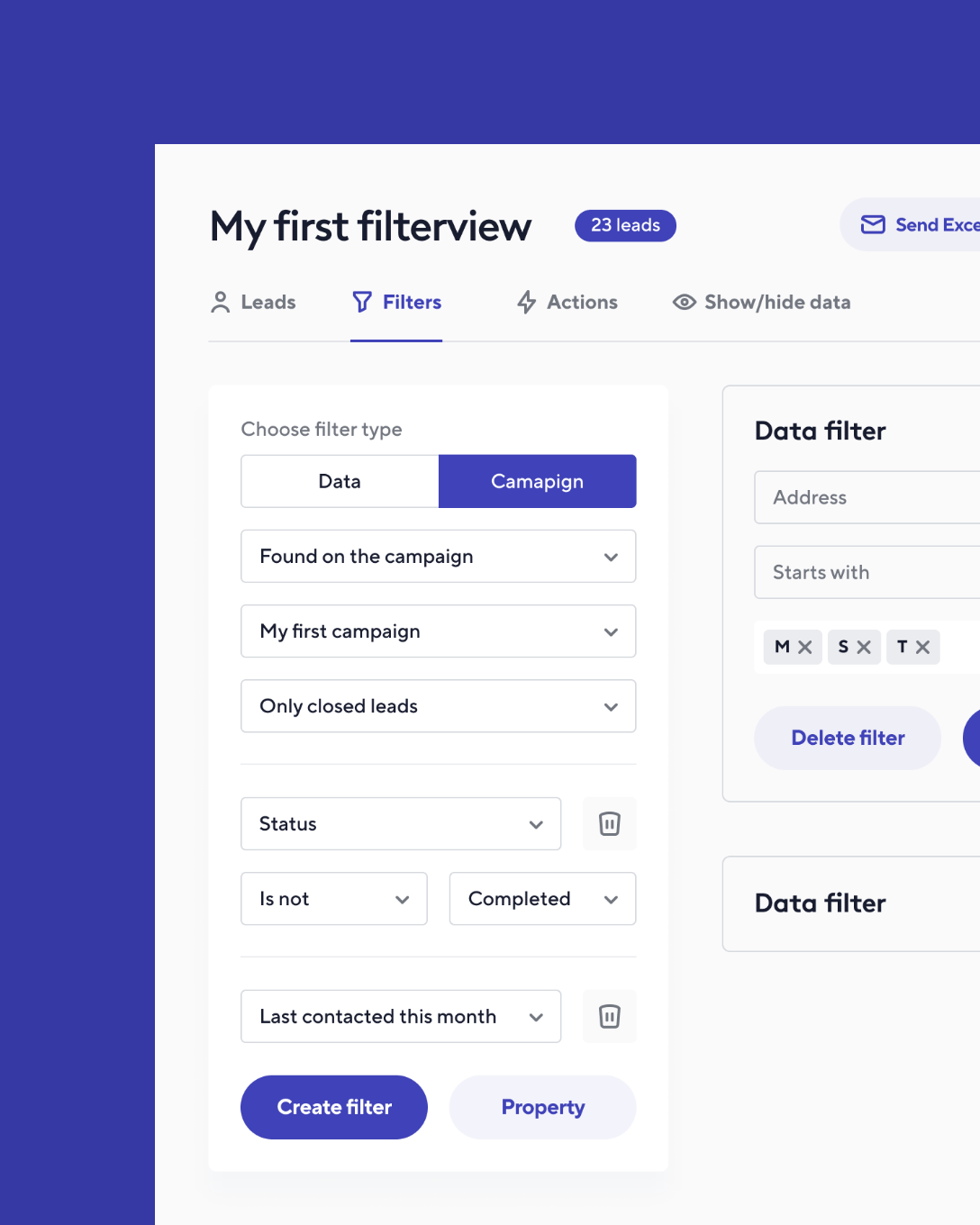
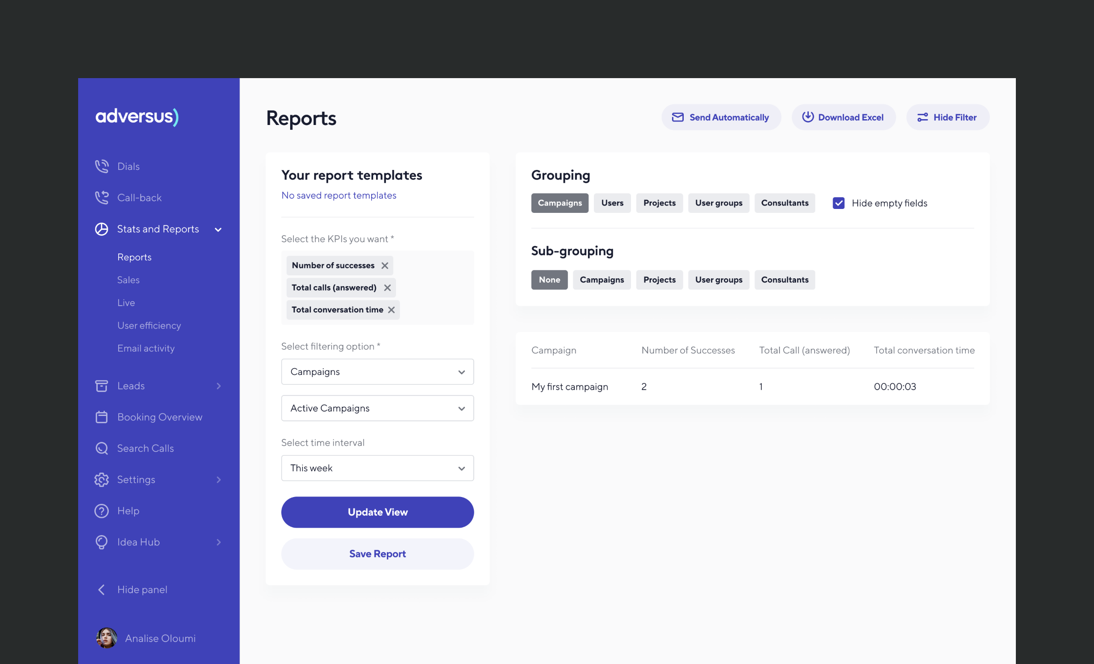
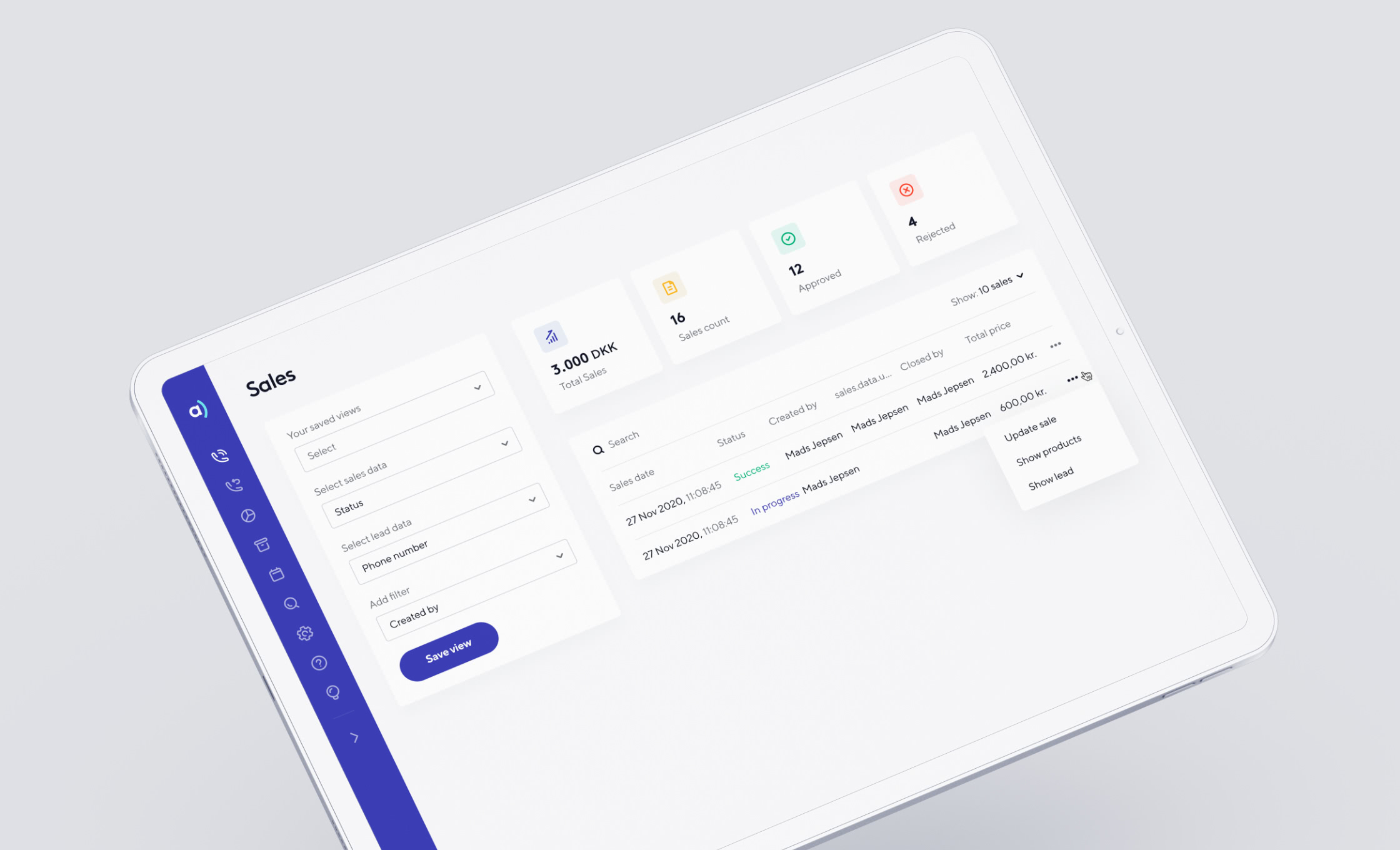
After 8 months of collaboration, we successfully launched the new Adversus brand and product.
In the quarter following the launch, Adversus expanded to 12 new markets and saw a vast increase of clients. The update was also very well received by existing clients.
Thanks to good extensive research and strong execution, we could create the right solution for Adversus - solving UX and design related issues.
“The interface is easy to handle and the agents adapts quickly. I think the workflow-section with calender-integration and journeys takes the customer experience to the next level.”
“Intuitive design - The user experience is amazing”
“Userfriendly design and helpful staff”
“The dialer is smart and functional”
“Utroligt brugervenligt”
